Sunday, 21 July 2013

Feedback

Having received feedback last last (the one before the last) thursday i have since produced these changes.

Here are some finals of the character. He is now fully rigged and weighted. The hair piece has also been finished. I've updated the shadow maps. I reduced the Depth map resolution from 8000-odd down to 2000 on the larger lights and 500 on the smaller ones. I have increased the filter size to 5. The render times have been reduced as a result by about half. In the boat scene i have taken the ambient out that was washing out the intensity of the main light and was also boosting the light on the shadows. I have lightened the shadows of the main light to compensate. This has allowed some nice bounce from the red lights from the anchor. 

I have since begun animating, it is going to be pushed right to the wire in terms of the deadline, but i feel the extra time spent on the aesthetic was worth it.


Wednesday, 10 July 2013

Update: Scenes and Character

I've been working on the scenes yet again, making a few adjustments (for the better) and though it's been eating away at the animating time, i feel it was worth it. 


 In the cabin scene i have moved the window between the pipe work and moved the lifebelt into the windows previous place. The lifebelt i feel is better placed and sits within the scene more naturally. The window now gives the pipes bend some more context and narratively gives more constructive objective. I've made the windows have the open space with a pane of glass over. I have also added glass over the divers suit enclosure. The metal objects have also been applied with a blinn material which has vastly improved the tonal range of the scene.

In the diner i have also added blinn materials to the metal objects, again improving the tonal range. The scene previously felt too cold with the blue/white light combination needed to be balanced out. I have added a red light exterior, which filters into the scene. I have tried to keep this muted so it keeps the audiences focus within the scene. I have added a small hint of a red ambient which has improved the intensity of the scene, improving the sense of fear.


This scene shows how the character will look in the shot being lit by the elements already in the scene. Below is the rig set up that has been produced using HumanIK. Which hopefully will be skinned properly by tomorrow evening, and then ready to animate over the weekend. 


Monday, 8 July 2013

Shading and Lighting Update...

 Please select and click images to view with the blacked out background, as they will appear this way in the final cut. 


The main part i am currently indecisive about is whether to retain the shadow from the light casing in the boat cabin scene. If i retain it, it will increase the drama as the boat moves and the shadow moves with it. A positive offset will be the decrease in movement i have to apply to the cabin which will in turn allow the dynamic to work more effectively. The negative for keeping them is the loss of clarity, which will obviously be gained if i remove them. However, this may result in less drama, and thus more exaggerated movement applied to the boats rotation. 

Saturday, 6 July 2013

Character + Lighting Update


The initial designs was aiming for that uncertainty within the design. Having started to model it became apparent that an overly defined character was not going to work and would clash against the aesthetic already established. I then started to refine the character to a simpler form.


The asymmetrical model still looked uncomfortable and unpleasing so i reverted back to the symmetrical process. It was also highlight by my supervisor that the odd model could potentially interfere with the silhouetting during the animation. I was keen to avoid just making another moom character. So i had added some definition and a different shaped head, but again these were unappealing and the two styles clashed together, rather than blending cohesively to produce the uncertainty.

At this point i went back to Tom Bancrofts book on character design and played about with basic shapes and proportions.


This is the end result. The hands differ just to add a bit more character without being overly suggestive on personality. I think the humanoid and cartoon style hands say more about his environment and situation than personality. The legs are a little large for some objects in the environments but they will be easily fixed.


I was to start shading the scene when i decided to just have a quick go with some lights to see how the atmosphere should look and to mu surprise the default shader produced some nice results. Although i need to apply a slightly darker lambert to differentiate between objects, i am pleased with the result, and i am now due to experiment with the other scene and adding small amounts of colour between the monochrome. In this example i added a red shader to the seat. This was for test reasons. It does not look like a car seat (more a cinema/theatre which could be interesting given the scenes movement is to reflect such an environment) but as a car seat will be colour appropriately. Updates to follow.


Thursday, 27 June 2013

Update on scenes...

The objects in the cabin scene have been placed to give them a more natural position in the scene. I have added a pod to hold the divers helmet with grips to suggest a full suit should be there. The anchor now has some drop holes with a protective cave. I have added a handrail to the door. The pipes have had sections remove to bring make more of a link with the windows, as feedback suggested they looked accidentally filled.


The cottage i had originally produced was ugly, lacked character and didn't aid the narrative or imply anything in particular. I had tried to accomodate the cottage i was seeking but was unable to get a good ration between roof and house that was consistant with the work. The one piece of good reference i found would not work with the tree i have designed. So i tried the opposite. I was thinking back to Madam Souzas house in Triplets Belleville Rendevous, and the personality of the house after the citys expansion (via railway lines) had bent it. The crooked body, aided with features that you could find on haunted house designs, though not overly so, help bring out the eerie nature that this could be something sinister but without over bearing. 

Finally the road is complete full rigged as is the chair. The only exception is the seatbelt that needs amending which will only take place once the character is modelled and rigged.

Tuesday, 18 June 2013

Revolving Floor Update

Having done a little more research i've been able to identify 3 processes for creating a fan belt/tank tread which will drive the motion of the floor. 

First is simple, using a torus which is then driven by a lattice - it is simple and fast. The only concern i have is that it warps the geometry, and this will have implications on the squared nature of the modelling. Although it could potentially follow the philosophy of overall warping that has been applied to the other scenes. 

The second, it the same again but with a curve and joint system connected with an IK chain, still being manipulated by a lattice. As you can see in a few post below, the main issue is the lattice manipulating the speed of movement via the warp regardless of the curve applied in the graph editor. 

The third process is via motion trail that has expressions added to it. This is the process i am going to adopt and this means i am going to have to make changes to the design of the set. I am going to use this system here:

http://ant-online.co.uk/tutorials/build-and-rig-tank-tracks-in-silo-and-maya/

This should allow for maximum control which is what is required for the movement. Having experienced difficulties with the size of the floor panels (being different sizes), the redesign will mean each panel is the same width and length so the spacing remains constant, but to achieve the aesthetic, or illusion that they are different sizes, the middle of each panel will have a cross point, so the four corners of different panels meet and this positioning can be manipulated within each individual panel. 


Monday, 17 June 2013

Boat Cabin update

Here is the updated cabin. I was concerned that the space was very empty and did not give the impression of a nautical setting. The solution was simply to create objects that would obviously be associated with water - hence the anchor, divers helmet and life belt. The other objects such as the mug, knife, light and fish bone chain were created to give a more domesticated feeling, to imply that the character may have been there for sometime. The placement of the objects appears sporadic and intended, which im not too sure i like, and may yet change. The consideration for the objects to carry obvious connections to the setting is because of the way the set will move. It will be chaotic, with the objects moving side to side as the 'boat' travels over the waves and so need to be identifiable over the motion. I am still tempted to add some more domesticated objects such as picture frames (that will be empty), but revising the requirements of the scene, i had identified at this stage it needs to be 'living' - believable. As a result i do not want to imply to much that the environment isn't real, as this idea will be established in the following scene.

For now i am going to look back over the motion of the floor for the final scene and see if there is anything in the dynamics which will be suitable.

Friday, 14 June 2013

Revolving Floor

Having started to rig the floor for the final scene i have encountered a few problems.

I have used a lattice on a NURBS curve to obtain the shape of the belt the floor panels will follow. On this curve is a joint system that is tied together using a IK spline handle. In order for the curve to maintain a consistant shape the lattice must remain active. 

The issue is that the warp of the lattice is affecting the spacing that Maya distributes each radian. So on a 360 degree turn over 360 frames the distance between each frame differs. It is producing random ease in and out points as can be seen in this video.


I have tried rebuilding the curve post warp in order to obtain an equal distribution but the is is still driven from the initial state. There are other videos where chains have been created where this problem doesn't exist, and i imagine the extreme warping only enhances the problem. The first test i did of this was much worse than the one you see here. Other videos have used motion paths, which means you have a fixed speed that cant be manipulated, and relies on objects created equal in length, and once binded rather than parented, warp with the curve as their geometry is influenced by the lattice.

I have messaged a few people to see if they can help. So for now i will go back to finishing off the cabin scene. Once, or if, i receive feedback i will decide on the next course of action. 

Tuesday, 11 June 2013

Final set movement/rig...


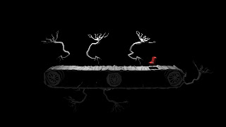
So here is a quick sketch of what i mean. The floor panels will look like that of the bus stop. The overall shape will be lower and wider. I think the trees will also be set up to follow the floor panels and will pop up and fold down as they enter and exit the scene just to give it that extra 'real world' synthetic feel i am seeking (as opposed to the synthetic feel of the computers perfect movement). I am going to see how to make tank tracks move in maya and work out the rig set up before i model. So hopefully there will be some possible rig plans up today or tomorrow.

Cottage Modelled...

This is the modelled bus stop. Again it has been manipulated in the modelling process to give an exaggerated perspective. It will sit as it is in open space. I like the idea of a bus stop on a small piece of ground that is ripping out like the big bang. Its own existence having a start and end point, as though our memories/experiences are fragments. Its a nice way to link the linear and cyclical elements of the narrative. Particularly as scientists are now thinking the universe expands to the point where a new one starts in the center, and consumes the old one outward from within. A fitting visual metaphor for the story to start again.


Here is the cottage modelled along with the tree that will also form part of the next scene albeit upside down. Its pretty straight forward, and as this scene will show via projection im not going to be overly fussy with the extras that will provide deeper meaning and act as potential pointers for the audience. 

My next concern is the final scene. I want this to look like an actual built theatre set. I already know how the chair will move, but i want the floor to feel mechanical. I want to make it obvious that the floor is moving and not the camera. On solution i have come up with is to rig a floor system like a set of tank wheels, and show the cogs turning underneath. 

Monday, 10 June 2013

The secret of making animation


Having received much attention online already it feels silly to repost it again. There is however an important piece of information to extract with regard to the narrative. For a moment it would be good to read into the politics the piece. It is following a particular trail of thought among animators about the gripe with corporates who assume animation should be quick, easy and cheap, with no real understanding of how much skill is required.

A reminder of how Crafton describes the tooniverse 

'The Tooniverse is a meeting place where the performances of the toons (the characters "there," on-screen, but also off-screen as my imagined beings), the animators (also "there," but off-screen and in the past), and my embodying performance (physically "here," off-screen, and cinesthetically"there," on-screen, in the present)...'
I've tried to find flaw in the definition of the tooniverse and the roles of the agents within the piece but i cannot find any. The only question i could raise was about the audience embodying the voiceover character, especially as we assume the setting could be his point of view. Meaning the audience could be embodying the character twice simultaneously, as they embody the voiceover character and he distributes agency to another (so it is distributed off-screen with the audience through character and then themselves). I'm not convinced this is an issue. The piece clearly has been influenced by outrospective ideals but im not sure it has much strength in making a point outside of the animation circle as it is presented as an in-joke for animators. I do not think the language of the location would make much sense to a 90 year old with no experience of maya or animation (an extreme example, but valid). It is entertainment. The audience is a passive co-creator. The audience, the intended audience, the animation community, will feel warmed by the ideals presented (People think it is this easy) and humoured by their lack of respect (As if people think its that easy) and the mocking of it. And in this instance, is the narrative embodying the audience?

Thursday, 6 June 2013

Diner - Update


Here is the diner modelled. Still a couple of small objects to add. Its been an interesting modelling process in that manipulating so many objects vertices from all viewpoints (Top, Front, Side) has been time consuming. Applying the localised difference, such as each flap of the blinds has been the most time consuming, applying their relationship to the overall scene has been the quicker process, in that it relies on lattice blend, and because of the reduced use of warps on the walls less manipulation required.

Thursday, 30 May 2013

Modelling update...

Here are some shots of the cabin set so far. Initially i had built the set square based on the plans. The plans were used as a rough guide mainly for creating the warps of the wood.
The one issue with this plan was the floors were the incorrect size, but this was easily resolved. Composed in the modelling with the other objects (with some still to do) this was the following outcome:


It was nice to see how useful the early test was at indicating the full set up. The translation of drawn shape into the model was pleasing. However, the overall aesthetic was still flat. The 90 degree angles of the set walls contradicts the local shape of the individual objects that create them. The energy was being killed by the flatness. It also worked against the philosophy of 'uncertain' which i identifies 90 degree angles as being certain. So, excluding the crates and pipe work, i warped the whole set. A few thoughts emerged during the process.


Firstly, how the blend of localised sub-object sharpness against and overall, smoother world blend works so nicely in 3D, and as a process, something i am keen to get in touch with Gregor Louden to discuss about, as it was his style i highlighted as an influence. 

Secondly, by pulling the middle of the sets towards the camera, several things are being manipulated which will implicate the movement of the objects, or at least could change the subtext of the movement.   Firstly, it mimics the depth that the camera lens creates. The overall effect of this as an image remains to be seen at this moment in time. I may post some test later. However, the lens will warp everything in the scene. In this instance the table and chair (the crates) have not been manipulated. Their scale will need manipulation and this will most likely wait until the character has been design and modelled. Their shape sits a little uneasy which i currently attribute to the scale. However, their perceived movement will be an important fact that will reinforce the philosophy of uncertainty. When the camera lens warps the environments, the movement of objects which normally create a straight line appear to move straight but can be warped simultaneously (see the video below), to give the appearance of moving curves. The crates though, when they move, will not follow the curve, they will not warp and i hypothesise that the contradiction of curve against line might act as an unsettling and uncertain agent that reinforces the sense that the environment might not be measurable in realistic terms on the audiences behalf. The success of this will be apparent in the animation process. 


The energy retained by warping the scene has created a consistant inconsistency. Looking back at my initial concept drawing, i instinctively drew the piece with a wider view plane to accommodate both sides as viewable. Interesting that i would be lead back toward that initial drawing.


Saturday, 25 May 2013

Quick modelling and shading test...


Im fairly pleased with how the modelling of the objects have retained the uncertainness of the drawings and how it has translated into 3d. The aesthetic ideally needs to look as though it is very refined but at the same time striving to be organic, i think the models represent that need. I was conscious whilst drawing that i needed to show restraint and hesitancy (change of direction). By having sharp corners, as opposed to smooth, the shape communicates the essence of a change but, absolute sharp corners, such as right angles are too certain, too assured, and drifts away from uncertainty. A positive result of this process is low poly models which will keep scene sizes low and will allow smoother running of software application, and reduce rendering time. The next stage, as i have designed the scenes now, will to be to draw them to scale, to size, ready for the final modelling process.

As you can see in the two image i have experimented with colour very briefly. The washed out look i am seeking contradict the energy of the models, and above, where i have increased the saturation of the colour, as well as the incandescence on the outline colours. This proposes two options, either reattempt to find a good colour palet and then manipulate mood with lighting - which i feel is important for an eerie environment, or i can go cell shaded, achieve the flat colours i am seeking, manipulate them slightly with ambient occlusion and lose the lighting. I think this is an issue i will come back to once i have designed the character and the to scale drawings of the environments.