Sunday, 21 July 2013

Feedback

Having received feedback last last (the one before the last) thursday i have since produced these changes.

Here are some finals of the character. He is now fully rigged and weighted. The hair piece has also been finished. I've updated the shadow maps. I reduced the Depth map resolution from 8000-odd down to 2000 on the larger lights and 500 on the smaller ones. I have increased the filter size to 5. The render times have been reduced as a result by about half. In the boat scene i have taken the ambient out that was washing out the intensity of the main light and was also boosting the light on the shadows. I have lightened the shadows of the main light to compensate. This has allowed some nice bounce from the red lights from the anchor. 

I have since begun animating, it is going to be pushed right to the wire in terms of the deadline, but i feel the extra time spent on the aesthetic was worth it.


Wednesday, 10 July 2013

Update: Scenes and Character

I've been working on the scenes yet again, making a few adjustments (for the better) and though it's been eating away at the animating time, i feel it was worth it. 


 In the cabin scene i have moved the window between the pipe work and moved the lifebelt into the windows previous place. The lifebelt i feel is better placed and sits within the scene more naturally. The window now gives the pipes bend some more context and narratively gives more constructive objective. I've made the windows have the open space with a pane of glass over. I have also added glass over the divers suit enclosure. The metal objects have also been applied with a blinn material which has vastly improved the tonal range of the scene.

In the diner i have also added blinn materials to the metal objects, again improving the tonal range. The scene previously felt too cold with the blue/white light combination needed to be balanced out. I have added a red light exterior, which filters into the scene. I have tried to keep this muted so it keeps the audiences focus within the scene. I have added a small hint of a red ambient which has improved the intensity of the scene, improving the sense of fear.


This scene shows how the character will look in the shot being lit by the elements already in the scene. Below is the rig set up that has been produced using HumanIK. Which hopefully will be skinned properly by tomorrow evening, and then ready to animate over the weekend. 


Monday, 8 July 2013

Shading and Lighting Update...

 Please select and click images to view with the blacked out background, as they will appear this way in the final cut. 


The main part i am currently indecisive about is whether to retain the shadow from the light casing in the boat cabin scene. If i retain it, it will increase the drama as the boat moves and the shadow moves with it. A positive offset will be the decrease in movement i have to apply to the cabin which will in turn allow the dynamic to work more effectively. The negative for keeping them is the loss of clarity, which will obviously be gained if i remove them. However, this may result in less drama, and thus more exaggerated movement applied to the boats rotation. 

Saturday, 6 July 2013

Character + Lighting Update


The initial designs was aiming for that uncertainty within the design. Having started to model it became apparent that an overly defined character was not going to work and would clash against the aesthetic already established. I then started to refine the character to a simpler form.


The asymmetrical model still looked uncomfortable and unpleasing so i reverted back to the symmetrical process. It was also highlight by my supervisor that the odd model could potentially interfere with the silhouetting during the animation. I was keen to avoid just making another moom character. So i had added some definition and a different shaped head, but again these were unappealing and the two styles clashed together, rather than blending cohesively to produce the uncertainty.

At this point i went back to Tom Bancrofts book on character design and played about with basic shapes and proportions.


This is the end result. The hands differ just to add a bit more character without being overly suggestive on personality. I think the humanoid and cartoon style hands say more about his environment and situation than personality. The legs are a little large for some objects in the environments but they will be easily fixed.
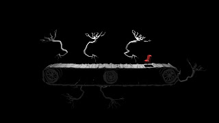

I was to start shading the scene when i decided to just have a quick go with some lights to see how the atmosphere should look and to mu surprise the default shader produced some nice results. Although i need to apply a slightly darker lambert to differentiate between objects, i am pleased with the result, and i am now due to experiment with the other scene and adding small amounts of colour between the monochrome. In this example i added a red shader to the seat. This was for test reasons. It does not look like a car seat (more a cinema/theatre which could be interesting given the scenes movement is to reflect such an environment) but as a car seat will be colour appropriately. Updates to follow.